
Dear Gmail, it's time for a redesign
Part 2 – The Solution(s)

Table of Content
Part 1 – The Problem(s)
Why now?
Information architecture chaos
⠀⠀⠀A confusing navigation
⠀⠀⠀"New Item" inconsistency
⠀⠀⠀Poor use of the Content panel
⠀⠀⠀Meet, Calendar and "The job to be done"
Product branding confusion
Part 2 – The Solution(s)
A redesign proposal centered around Workspace
⠀⠀⠀Addressing current branding issues
⠀⠀⠀Introducing a truly unified Workspace experience
⠀⠀⠀Improving usability, discoverability and ultimately adoption
The real solution
A redesign proposal centered around Workspace
In Part 1 of this article I described in details the challenges of current Gmail design; let’s now look at a redesign proposal to address them.
The following proposal is designed around some assumptions of Google strategy based solely on external public information and of course without any user data or internal product strategy awareness:
According to recent marketing announcements, Workspace is the umbrella brand for all the Google communication and collaboration products “to reflect Google ambitious product vision and the way our products work together”
The goal of Workspace is set to deliver a “deeply integrated user experience”, offering “everything you need to get anything done, now in one place”
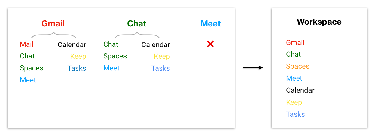
Looking at Gmail, Workspace flagship product, it seems that Google selected a few key products to be consolidated under a single interface: Mail, Chat, Spaces, Meet as well as Calendar, Tasks, Keep.
Addressing current branding issues
Based on the above assumptions, I propose to make Google Workspace, not Gmail, the top level brand also from a product perspective.
All the product brands should then always report to Workspace at the same hierarchical level.
This also means:
No more Chat, Spaces, Meet brands sometimes presented independently as standalone apps, sometimes grouped under Gmail or Chat apps themselves, or not at all as in Meet
No more Calendar, Keep, Tasks brands sometimes presented independently as standalone apps, sometimes just relegated to the side app panel
Chat and Spaces to be separated and presented hierarchically as equivalent
The product branding hierarchy is now very clear and immediately intuitive. Let’s see now how it can be presented to users in Workspace products.
Introducing a truly unified Workspace experience
In addition to the branding suggestion above, I propose the following to address the key user experience issues previously described:
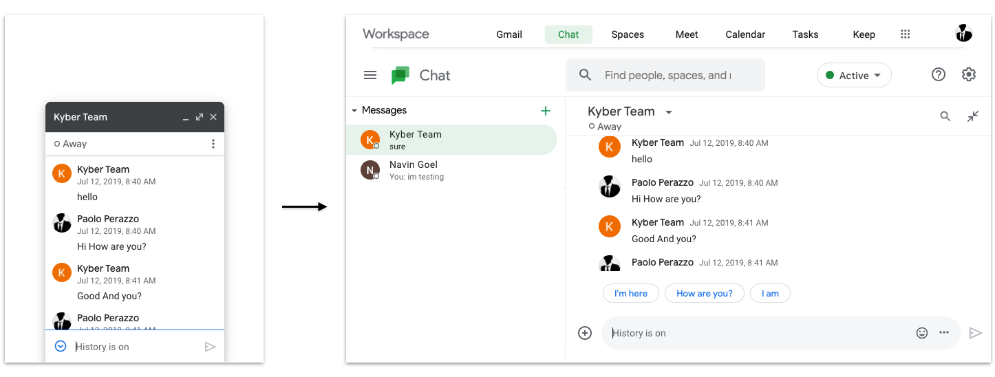
A new Workspace interface is introduced to unify all Workspace products. Such interface consists of a global navigation bar added to all Workspace products, carrying Workspace as top level brand and listing primary navigation links to all the Workspaces apps for easy and intuitive navigation between them.
Importantly, no matter what app the users accesses first, they will always be presented with the same Workspace brand and navigation, solving the navigation inconsistencies previously shown:
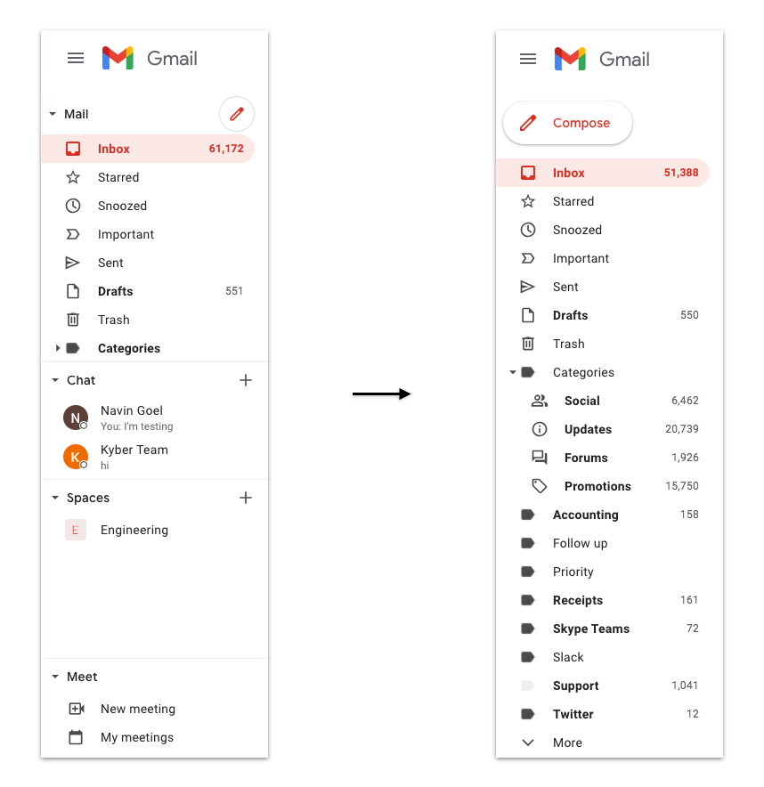
The new unified navigation bar allows the removal of the navigation between Workspace apps from the left panel and the right side bar of Gmail, Chat or Calendar (side bar only); the left panel can now be dedicated exclusively to secondary navigation links for the selected app (e.g. email folders for Gmail, users for Chat, etc.) and the right panel to third party apps
The selected app is always presented in "full screen" mode (e.g. no floating Chat windows or Tasks confined in the right app panel), with its dedicated secondary links on the left panel and content in the middle panel
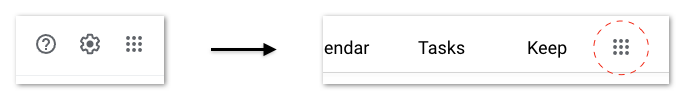
The More apps button is moved to the new Workspace navigation bar, more appropriately grouped with the rest of the apps rather than with Support and Settings as it is currently:
As the user information applies to all the Workspace apps, the Google Account profile button can be removed from each individual app, and positioned in the top right corner of the Workplace bar, the area typically dedicated to System Information. This helps also making the UI consistent as sometimes the Google brand is presented next to the profile picture (Gmail) and sometimes is not (Chat, Calendar, Meet):

Improving usability, discoverability and ultimately adoption
Adopting the proposed information architecture allows a unified and consistent user experience across all Workspace products:
In terms of navigation between apps, users can now easily switch between all Workspace apps from a single area, rather than jumping between left and right panels or, worse, between browser tabs. It also allows to access other Workspace apps from any app, not just a subset as it happens now. This solution follows a standard, well known, design pattern that put primary navigation links in the top area. The experience can be delivered in a very snappy and elegant way; keyboard shortcuts can also be added for power users to quickly switch between apps (e.g. Option + 1 for Gmail, Option + 2 for Chat, etc)
Content navigation and new item creation for each individual app is now simplified and dedicated, utilizing the entire left panel only for the secondary navigation links, once again following standard design patterns; the browsing experience for the app in use is now optimized allowing users to easily access their content:

From a usability perspective, consistently presenting all the Workspace apps in "full screen" enables to deliver their best potential as "real", standalone apps rather than just add-ons to Gmail, still remaining one click away from each other in the same interface:

A key benefit of the Workspace navigation bar is that apps are now prominently (and consistently) presented to users across all Workplace properties, without being intrusive and impacting the usability of individual apps like it happens today.
Users can try Workspace apps they don't know yet and likely keep using them as they are just one click away from the apps they already useApp badges that highlight new items received from others since user last accessed that app (which is different than showing all unread items for the app) drive re-engagement: new emails, new messages, new assigned tasks, new meeting invites, etc.
Showing badges for new items is more subtle than having a chat popping up while typing an email and less prone to become noise than displaying unread items:

As a result, Google can now offer a complete, unified solution under the Workspace brand that clearly showcase the value proposition of its entire product portfolio. Users can now immediately compare Google Workspace with the equivalent Microsoft Office brand and value the benefit of a comprehensive rather than point solutions like Zoom, Slack, etc.
The real solution
The proposed solution is purposely practical and not overly ambitious. Its goal is to fix today’s offering by properly reorganizing Gmail information architecture, without “debating” the current product portfolio strategy pursued in Gmail. These are changes that I consider table stakes. The impact in product usability and adoption would certainly be significant, but in my opinion still incremental.
What else could be done, with some more “freedom”?
First, I’d make simple yet important changes on the product portfolio composition presented today in Gmail:
I'd consolidate Meet with Calendar and other Workspace apps to remove the confusion I described earlier and to ultimately deliver a video conferencing experience centered around actual user needs and workflows. There are several ways to ensure not only visibility, but also increased adoption for the Meet functionality without impacting the user experience of other products
I'd remove Keep: I don’t think it’s ready for prime time and it seems lacking the resources and commitment to compete with popular note taking apps. Offering a low-quality product impacts the overall user perception of Workspace apps, making users skeptical about trying new ones. Google Docs can partially compensate this hole in the product portfolio anyway
I’d prominently display in the new Workspace bar links to Docs and Sheets, presumably the most popular Editor apps, and to Drive (access to files) rather than keeping them hidden behind the crowded More Apps interface. These are key tools for work that strengthen the value proposition of Workspace solution:

Then, there are a few initiatives that would be much more disruptive, certainly requiring a relatively significant effort in terms of design and development. But to win this game, I believe something different than the status quo is required:
Email clients today are still designed as a single-player app. But at work, we don’t work alone: we have teams, groups, departments inside the company and partners, vendors, clients collaborating from other companies.
Workspace Gmail should evolve into a multi-player/team-based app, much like Slack did with messaging making it an instant success at work. The opportunity for Gmail to regain the user attention lost as a product to Slack and Microsoft Teams is just a few team features away: Google already owns through Gmail the client distribution within organizations and email is in my opinion the right protocol to be used as foundation of message-based collaboration.
In fact, the more I worked on Slack, the more I realized that, while messaging is certainly appropriate for quick, real time conversations in 1-o-1 or small groups contexts, it’s debatable that it is better than email in larger settings like Slack channels. Messaging there quickly becomes unmanageable, difficult to understand and summarize. Furthermore, it is unnecessarily complicated to setup and maintain when interacting with external parties – why Slack Connect, Slack shared channels, etc. when we already have email connecting companies?
A team-based Gmail would also provide the business graph for all Workspace communication and collaboration apps. Owning the business graph of a department or company is something that Slack successfully exploited just within messaging: imagine distributing it across the entire Workspace portfolio and ecosystem. Making Gmail multi-player is not as crazy or difficult as one might think, but that’s the topic for another blog.The next step after making Gmail multi-player is to eliminate Spaces and incorporate those concepts in this new Gmail. Strategically, I don’t think Google should (or needs to) compete head to head with Slack or Microsoft Teams by providing a sort of messaging copycat with Spaces.
As a Workspace user, I’m being forced to think when and why to use Gmail vs. Spaces, email vs. messaging, when I simply want to communicate and collaborate with my team. The moment you make users think, you have lost as a product designer.
As per the points made above, I think Gmail strategy should be to focus on improving Gmail as a team and collaboration product, building similar Slack/Spaces capabilities but on top of email as the “transport layer”.
This is clearly a controversial take, but I think it would be worth exploring it before investing in a catch up game with competition: I do think that there is something there worth at least a discussion.What’s also obvious to me is that Workspace needs a much more solid, team-based Tasks app, standalone and not relegated to a side panel. Ultimately we go to work to work on tasks, delegate them, discuss them, complete them: a great tool to track them and enable task-related workflows is a must. I personally believe that such tool could become the centerpiece of the Workspace experience, a sort of actionable dashboard for personal and team collaboration.
I’d keep Tasks lightweight and not bloated like the typical task/project management, but rather deeply integrated with all the other Workspace apps: any task created in an email, chat, meeting, document, spreadsheet, presentation, etc. should go into Tasks – one unified place to see what my teammates and I have to do.
With the evolution of Gmail (and Tasks) into team-based collaboration and productivity products, Workspace will have a much more streamlined and well integrate product offering. Their users will be able to continue using the same (improved) email client and optionally utilize more advanced collaboration and productivity tools built on top of it: no need to install one or more new apps across the entire organizations, no need to setup special communication channels across organizations if they use Workspace too.
But to truly deliver a “deeply integrated user experience” that goes well beyond others, Gmail must layer in Artificial Intelligence (A.I.) to orchestrate the human interactions happening in Workspace communication products (Gmail, Chat, Meet). A.I. can be used to weave these apps together fundamentally at the data layer and use the content created and recorded in Workspace editor (Docs, Sheet, Slides) and productivity apps (Calendar, Tasks) to personalize the experience and start making smart recommendations.
Imagine using a combination of machine learning and natural language processing to surface and summarize important information from conversations or documents, and make them actionable by routing and storing that information to the relevant system of record. A message turned into a task, an email with an invitation to meet turned into a Calendar event, a question turned into a poll, the salient points of a meeting summarized and turned into action items or recorded as decisions in a document, an asynchronous standup meeting generated from the activity in Tasks, Calendar, Docs/Sheets or Gmail and so on.
This is not science fiction. It’s a model I designed for Kyber’s layer of collaboration and productivity on top of messaging that simply requires the right productization of existing A.I. technologies.
There is probably no company on the planet better positioned than Google to leverage its extensive expertise in A.I. to achieve this ambitious vision. And finally, definitely, leapfrog the competition and really be my one and only workspace.