
Dear Gmail, it's time for a redesign
Part 1 – The Problem(s)

Table of Content
Part 1 – The Problem(s)
Why now?
Information architecture chaos
⠀⠀⠀A confusing navigation
⠀⠀⠀"New Item" inconsistency
⠀⠀⠀Poor use of the Content panel
⠀⠀⠀Meet, Calendar and "The job to be done"
Product branding confusion
Part 2 – The Solution(s)
A redesign proposal centered around Workspace
⠀⠀⠀Addressing current branding issues
⠀⠀⠀Introducing a truly unified Workspace experience
⠀⠀⠀Improving usability, discoverability and ultimately adoption
The real solution
Why now?
It’s time for a redesign of Gmail. By redesign I don’t mean a cosmetic facelift, i.e. “how it looks”, but more an overhaul at the organizational, structural and functional level, i.e. “how it works”.
I still remember when Gmail launched back in 2004. It’s fair to say that Gmail started a new era for the web, being the first major cloud-based app aiming to replace conventional desktop software.
I was immediately fascinated by AJAX (Asynchronous JavaScript and XML), the new development approach behind Gmail: AJAX allowed web pages and web applications, to change content dynamically without the need to reload the entire page. You could finally build a desktop-like app on the web!
Here is how Gmail first looked:

In 2006, Google Talk got integrated into Gmail, adding chat functionality to the original email product:
But for the next decade or so, Gmail had relatively limited changes in terms of product design:
Email remained the core functionality, just enhanced with several new features
Chat didn’t change much, despite going through several iterations
The overall information architecture remained the same, despite UI, color scheme, and branding updates.
Recently, though, in an effort to integrate and promote various new services and to emphasize its business version, Gmail changed quite a bit with the addition of Spaces, Meet, Calendar, Keep, and Tasks to its interface.
However, layering multiple functionalities over time inside an existing app can create several usability and adoption challenges, impacting both the original app functionality (Mail) and the new ones. The recipe for disaster is simple: you start adding the first new functionality without making major redesign as there is no practical need (Chat was simply added to the left navigation panel and as a discreet floating window); but then you end up paying the price when layering the other functionalities (Spaces, Meet, Calendar, Keep, Tasks) following that same design pattern.
I know because I've done it myself in products I’ve built from scratch: you start with an initial hypothesis, you release your product right away to test it with users, you find some product/market fit, and as your user base grows fast, you want to add features as quickly as possible to iterate and test new hypothesis. You feel the need for speed. You then arrive to a point when you realize you have built this cool yet unstable tall tower that barely stands: new users are getting confused, the usability is impacted, the quality of your product declines.
Sometimes, that is an ok price to pay, especially at the beginning: you now validated your hypothesis, you gathered information you didn't have when you started, you have requirements you didn't think about originally, your strategy might have adapted to market and user evolution.
After this discovery and validation phase, it’s time for a redesign though, to remove the unnecessary, to reorganize the app information architecture that you “broke” by “moving fast”. You will be amazed how your product becomes obvious after this process.
This situation is very common in the early days of fast paced startups, but I’d argue that the same happened during recent Gmail evolution: rapidly increasing competition leveraging Best of Breed (e.g. Slack, Zoom) or distribution (e.g. Microsoft Teams) strategies, along with unprecedented demand and new requirements from the Covid era, put Google in startup mode to respond with the new Gmail in a very short period of time.
That effort has been impressive, but now it’s time for a redesign.
Information architecture chaos
Information architecture is a fundamental aspect of design that focuses on structuring websites’ and apps’ content, organizing their information, and helping users navigate them to find information and complete tasks. A poor information architecture has a severe impact on the usability, adoption and retention of a product.
As such, I’m going to start by reviewing Gmail information architecture to highlight areas of improvement.
A confusing navigation
Let’s begin with the navigation of Gmail. Navigation is one of the most important components of an app information architecture and has a direct connection with usability: it drives users around the app, it helps them discover features and access content.
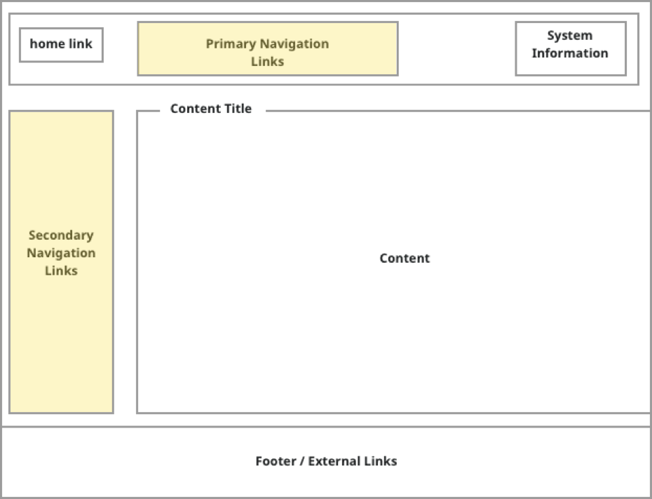
At the most simplistic level, app navigation is achieved through Primary and Secondary Navigation Links:
Primary Navigation Links enable users to switch between the main sections of an app
Secondary Navigation Links let users browse the content of the section currently selected via Primary Navigation Links
The content selected with Secondary Navigation Links is then displayed in the Content panel
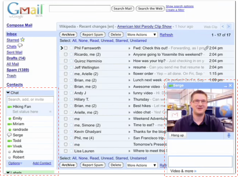
Gmail does not follow this standard, well-known model. The navigation between Workspace apps is scattered between left panel, right side bar and top right corner.
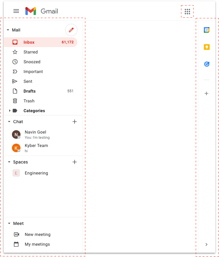
The left panel, typically dedicated to the secondary navigation links, includes not only the navigation for Gmail content (i.e. email folders), but also primary navigation links to Chat, Spaces, Meet along with their own secondary navigation links (Chat: users, Spaces: chat rooms, Meet: meeting creation and meetings).
The side bar on the right has primary navigation links to the Calendar, Keep and Tasks apps, that are then opened next to it in another panel (I’ll call it the “app panel”).
Lastly, a More apps button is placed in the top right corner, mixed with System Information elements (Support, Settings, User Profile).
In general, the navigation of communications apps is a tricky design problem that get worse the more the user uses the product: the more folders, the more users, the more chat rooms a user adds, the more the navigation becomes difficult.
Having some of the Workspace apps’ navigation cramped in the left panel creates an important usability challenge. If a user wants to use Gmail for email, their email navigation experience is impacted by the presence of Chat, Spaces, and Meet occupying space in the left panel and hiding a good portion of email folders and functionalities. The user has no choice but to scroll within each app navigation section to find and surface hidden items.
Yes, the presence of each section can be minimized with the toggles (still impacting navigation of other apps), resized or even removed via Settings (if user knows about it), but then it defeats the purpose of having them there.
There is also another option in Settings that allows users to move Chat, Spaces and Meet on the right side of the middle panel:

I personally think that this option is even worse:
It has now 3 different navigation areas: left panel, right panel, right side bar
It significantly reduces the Content panel, which still is the primary component of an app
It introduces an awkward UX, where both the Chat/Spaces/Meet navigation panel and the app navigation side bar are covered by the app panel when an app like Calendar is opened; the user is therefore forced to close the app to switch to Chat/Spaces/Meet or any other 3rd-party apps:

This behavior is actually different when Chat/Spaces/Meet navigation is on the left panel: in this case the navigation side bar is kept visible when an app is opened, allowing access to all the apps at any time. Awkwardly though, the navigation side bar is then moved in the middle rather than kept on the right edge; UI elements like navigation should have a fixed position in the overall app layout so that users can easily find them:

As a matter of fact, when the Quick Settings panel is opened, the app side bar is kept on the right edge:

Beside these obvious UX inconsistencies, having to switch between the left panel to the right side bar to access other Workspace apps might create another level of confusion for the user: Why are these Workspace apps accessible on the right differently from the others on the left? Why are these Workspace apps displayed in the smaller app panel rather than using the entire Content panel like Gmail, Spaces, Meet? Or vice versa, why Chat, Spaces or Meet are not using the right app panel when in Gmail?
Overall, it’s clear that Gmail’s attempt to consolidate multiple apps into a single interface creates key navigation challenges that significantly affect usability.
“New Item” inconsistency
Another issue with the information architecture of Gmail’s left panel is the inconsistent placement and visual representation of the “New Item” functionality (i.e. compose an email, start a chat, create a space, start a meeting).
Consistency is essential to reducing the cognitive load of a user interface. Consistency creates familiarity, and familiar interfaces are naturally more usable. When a design is consistent, every interaction feels smooth and frictionless. When a design is too inconsistent, it hinders learnability and drives frustrated users away from using a product.
As you can see by collapsing all the toggles in Gmail, the “New Item” functionality is inconsistently presented to users:
Mail uses an icon depicting a red pencil next to the toggle header
Both Chat and Space use a black + symbol next to the toggle header, different (and misaligned) from Mail red pencil
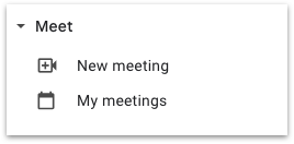
Meet doesn’t show anything at the toggle header level, but instead uses a text button (New meeting) nested under it and mixed with app secondary navigation links (My meetings)

For Mail, you might not have the above UI as Google seems to be doing several A/B tests. I have several accounts with Gmail, consumer and business, and I have seen at least two additional versions, with the one on the left likely to become the new default for everyone:

💡 A quick observation around A/B testing. I understand its importance, but it doesn't make sense in my opinion to A/B test the same user. I personally don't care as I enjoy seeing these experiments, but I'm the exception: a regular user is disoriented by seeing the same product with different UI across accounts or just type, consumer vs. business. A check on the IP address or cookies can easily prevent this type of bad user experience.
Here the inconsistency is aggravated by the fact that the Compose button is (prominently) displayed below the Gmail logo and removed from the Mail toggle header. This strong association of the Gmail logo only with the “New Item” element for Mail seems to imply that Gmail remains fundamentally a Mail app, rather than an umbrella product combining Workplaces apps as it was supposed to.
In design, one reason to break consistency is to draw attention to a single specific element, Mail Compose in this case. But in this context, such need proves once again that there is something wrong with the attempt to consolidate apps in the crowded left navigation panel in Gmail.
For sure, there is no reason for Meet to behave differently from any other app: the “New Item” for Meet (New meeting) is surprisingly listed under Meet header as if it were a secondary navigation link:
Then, if you click My meetings, another New meeting button is shown in the Content panel, along with a Join a meeting button (which is not shown in the left panel):

The consumer version of Gmail takes in consideration this observation, by listing also a Join a meeting label under Meet. But here My meetings is inexplicably gone:

The same “New Item” inconsistency is by the way replicated on mobile:

Mail, Chat, Spaces tabs all have a “New item” button floating in the bottom right corner, while Meet doesn't. Mail has the same pencil icon of the web app, Spaces the same +, but Chat has a “chat bubble” instead of the +. The “New Item” for Meet is represented with a button inside the canvas area; the button uses a blue background, rather than the red that is used across all the buttons in the Gmail app.
Creating content is one of the most fundamental user flows for Workspace apps: not forcing users to learn different representations to perform the same task, but rather providing a consistent and intuitive way can have a significant impact in adoption and retention for all Workspace apps.
Poor use of the Content panel
Let’s take a look now at the way each app in Gmail presents its content to users, the most important part of the whole product design.
In web design, the Content panel is the area used to display app content, i.e. the core app functionalities. It’s where users find the tools to complete their tasks, it’s where they spend most of their time:

Mail
The Mail app doesn’t seem to have any major UX issue here: the Content panel is used to first display the list of email snippets and then the selected email thread in full screen.
Let’s then look at the Chat app, that includes Chat and Spaces.
💡 Due to product branding confusion that I’ll discuss in details later, I use Chat app to distinguish the standalone Workspace product available at chat.google.com from Chat, the functionality of direct messaging that is part of the Chat app, also present in Gmail.
Chat
Chat in Gmail has one of the most unusual UI/UX to display its content:
When in use, a floating chat window is opened covering the Gmail Content panel and needs to be minimized to go back to email:

When someone starts chatting with you, their floating chat window is abruptly opened on top of your content, disrupting your work
Assuming you notice the diagonal arrows in the top right of the chat window, you can expand the individual chat in what's described as "full screen"; in this mode, the entire Content panel is used to display the chat with that user.
This brings good and bad news:The chat itself looks more user-friendly and more what users are "used to", both within Gmail and in other chat apps
Chat behavior is now consistent with Mail/Spaces/Meet information architecture (navigation on the left, content in the Content panel)
But for some reason, even if you discovered this layout, you can't keep using it: as soon as you switch to Mail, Spaces, Meet, Settings or whatever and then come back to Chat, the window is re-opened as a floating one, making me wonder what’s the use case for designing this UX.
Chat seems to behave as an add-on to Gmail, rather than a full app. Historically, that’s how the consumer Google Talk was introduced back into 2006, but after the explosion of messaging not only in consumer but also in business this doesn’t seem acceptable anymore.
As a matter of fact, if you use the “standalone” Chat app at chat.google.com, the full screen mode for Chat is the default behavior, so it’s not clear why in Gmail is the opposite. In Chat app you can also open the chat window in floating mode directly from the left navigation panel by clicking on ↘︎, but for some reason the equivalent option to open Chat in full screen mode in Gmail is not available; if present, it would have allowed users to use the full screen mode if preferred:

💡 Note how there are no unified design rules applied across Workspace apps: the same left navigation panel is 256 pixel large in Gmail, but 320 in Chat app. Out of curiosity I also checked other standalone apps: Calendar, 256 pixels; Keep, 300 (?) pixels, Meet, no left navigation panel. Having a simple set of design rules can easily avoid these UI basic inconsistencies across portfolio products.
Spaces
The confusion increases when looking at Spaces, the chat room component of the Chat app. In Gmail as well as in the standalone Chat app, the full screen mode is the default behavior and also here you can open the chat room in floating mode directly from the navigation panel by clicking on ↘︎:

Therefore, Chat content UX in Gmail remains the exception:

Why not have also Chat follow the same, standard, UX behavior to display app content, especially as even its companion app, Spaces, already uses it? Is this floating mode even useful? Why not just removing it, as it also introduces weird behaviors when switching from floating to full screen mode?
In summary, Chat’s floating window suffers from both external and internal UX inconsistency: external as it differs from similar messaging products, internal as it differs in particular from Spaces, but also from Mail and Meet that use the entire content panel as well.
This is important because users already tend to apply rules they’ve experienced in other products, bringing in their own messaging expectations when using Chat in Gmail. Presenting a behavior completely different also from the other components of the same product unnecessarily forces users to learn a whole new toolset, causing confusion and alienation.
Spaces also introduce another layer of navigation with tabs (Chat, Files, Tasks) inside the Content panel:
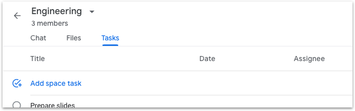
I’m not going to comment much on UI/UX issues like the lack of visual hierarchy, the different UI separators for each sub-header and sub-section, the weird UX in the Tasks app, as I rather focus this time on another important aspect of design: app performance, i.e. the loading time of each Space tab.
Performance is user experience. Performance is about engaging and retaining users. In general, slow websites lead to lower conversion and increased bounce rates: imagine how fundamental is the performance of an app for work, accessed every day, multiple times a day, by multiple team members.
Every time a space is accessed, both Files and Tasks tab are reloaded when visited, keeping users hanging for 1 to 2 seconds at least. Every-single-time: user check a task in a space, switches to Chat or Mail to send a message, comes back to the same space, reopen Tasks and Tasks is reloaded:

💡 One way to improve performance almost “for free” is to create the illusion of speed. When loading a page, using skeleton screens mapping the content once it’s loaded instead of using loading spinners give users such illusion. This is known as the principle of natural mapping and can be used by designers while waiting for engineers to actually optimize loading speed. Spaces could have at least leveraged this design “trick”.
Even with the same space open, if you switch from Chat to Files a full reload occurs again, but it doesn’t if you switch from Tasks directly to Files (if you switch to Chat just once, a reload is triggered anyway): this different behavior between tabs proves that the reload is technically not necessary (of course), but just the result of some buggy, not-tested, implementation.
When people use web apps, they want them to deliver fast and efficient performance. According to a Google research, “beyond 1000 milliseconds (1 second), users lose focus on the task they are performing”. The study further explains that “When pages load slowly, user attention wanders, and users perceive the task as broken. Sites that load quickly have longer average sessions, lower bounce rates”.
The sluggish UX of Spaces has a very significant impact on the usability and ultimately adoption of a product that needs to compete with more polished Slack or widely distributed Microsoft Teams.
Good performance is good design.
Meet
Meet presents another pretty unusual use of the Content panel: the panel is further split in two areas, the left to display the list of upcoming meetings, the right to display the details of the selected meeting:

As a result, the layout is now split in 4 areas, or even 5 when the app panel is opened on the right. The cognitive overload for the user is excessive. The visual separation between these many areas doesn’t help either: every single area is separated from the one next to it in a different way and with no visual hierarchy (why is the darker separator in the middle of the content panel?) Moreover, the same functionalities are repeated multiple times in the various areas as well as in the Calendar if opened in the app panel: three ways to create a new meeting (two New meeting buttons plus click on Calendar time slot), four ways to join a meeting (four different buttons: Join, Join a meeting, Join now, Join with Google Meet). Lastly, the Edit in Calendar button opens the standalone Calendar app in an external app instead of the Calendar in the Gmail app panel, even if already opened right next to it.
How could one simplify this view and make it less overwhelming, more usable? Basic observations on the information architecture can help here: the fundamental issue is that secondary navigation links for Meet (the meetings) are listed in the left side (2) of the Content panel and used to display content details in the right side (3); as a result, the user needs to go through three layers (My meetings ⇒ List of meetings ⇒ Meeting details) just to display the information of a meeting.
I see two alternative approaches here:
From a hierarchy perspective, the list of upcoming meetings could be considered equivalent to Mail folders, Chat users, Spaces chat rooms and therefore moved under the Meet toggle header in the navigation left panel (1) to replace My meetings; when user clicks on one item there, the meeting details are displayed using the entire Content panel, removing the need for (2).
If there was some reason (e.g. future features/use cases) to group meetings like with My meetings and that has to be preserved in (1), then the list of meetings in (2) should be considered analogous to email threads in Mail and therefore displayed using the entire Content panel; with more space, the more relevant of information from (3) can be displayed along with the meeting name, start and end time; the rest can be accessed by clicking on the meeting itself, exactly like when an email thread is opened in Mail from the thread list.
In either case, it’s definitely possible to significantly reduce the cognitive overload for what at the end is a very simple app, with minimal functionalities and content to be displayed.
Meet, Calendar and “The job to be done”
On top of information architecture, the content strategy of an app plays a fundamental role in delivering a meaningful and delightful user experience.
Successful strategic content helps users learn about and distinguish the many functionalities of an app, make informed decisions on which component to use for a given task, easily find their way to complete such task. The content strategy for an app is centered around a deep understanding and empathy for the users, their motivations and goals.
I personally found the content strategy for Meet, as well as its relationship with Calendar, highly confusing.
As a user, when I read the My meetings label under Meet toggle header, I assume I'll be able to see all my meetings, i.e. any in person, video, or call meeting, of course independently of the software that will be used.
Here instead I can see only the video meetings, in particular only those where I'll use Meet and only those for today and tomorrow (I did some test to figure this out - an Upcoming meetings label would have been more clear).
The confusion is even more obvious when I open the Calendar in the right app panel. In the example below I don't see any meetings in Meet, but I see two in the Calendar (one Zoom, one in person):

The text at the bottom of the Meet panel adds more confusion, rather than clearing it up: "Video meetings scheduled in Google Calendar show up here". In fact, I have a Zoom video meeting in Calendar and based on that text, I'd expect to show up in the Meet panel too. Of course it does not.
And sure, by seeing the hierarchy of My meetings nested under Meet, I could have understood that those were only “My Meet meetings” - but that’s a designer’s wishful thinking and more importantly why would a user want that?
When designing products, a good place to start is to ask what's the job to be done for the user. In the case of meetings, there are two main jobs to be done:
As a user, I want to view my meetings, so I can join them
As a user, I want to organize a meeting, so I can meet now or later
Gmail gives users two tools to get these two jobs done: Meet and Calendar.
Job to be done #1 - View meetings to join
As observed before, Meet shows only a subset of the information already present in the Calendar (meetings with Meet links). So to get the first part of job #1 done ("view my meetings"), the user would probably always go to the Calendar: not finding an upcoming meeting in Meet wouldn’t mean that the user doesn’t have any meeting to attend; a user has also no idea if the meeting was scheduled with Meet or not, so they wouldn’t think to go to Meet even if the meeting was indeed a Meet one.
To get the second part of job #1 done (“join meeting”), the user can join a Meet meeting either from Meet by clicking Join button from the event itself or from Calendar by first opening the event and then clicking a Join with Google Meet link (instead of a Join button):

So in this case, the user gets a better user experience with Meet (less clicks, obvious call to action). But only if it's a Meet meeting...
Job to be done #2 - Organize meetings, now or later
In Gmail, organizing a meeting depends on whether the meeting starts now (instant meeting) or later (scheduled meeting).
An instant Meet meeting can be started from Meet with one of the New Meeting buttons, but can not be from Calendar.
A scheduled Meet meeting can be scheduled from the Calendar, but inexplicably can not be from Meet itself.

As a result, to get job #2 done, the user is expected to use Meet to start an instant Meet meeting and to use Calendar to schedule a meeting (even a Meet one). That's a lot of thinking for a user just to have a meeting.
Also here I looked at the standalone Meet app available at meet.google.com to compare the user experience and to understand it better. Similarly to Gmail, a New meeting button is presented to the user:

But while New Meeting in Gmail simply creates a meeting, the same button with same icon in Meet presents 3 options:
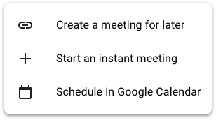
Create a meeting for later opens a pop-up that asks users to send the Meet link “to people” and “to save it” to use it later (no start time is asked); this is the same UX of New meeting in Gmail, but there there is a Send invite button and the call to action to Join now (that’s why I previously called it “Instant meeting”):

Start an instant meeting starts the video call immediately, displaying an overlay asking to Add others. Beside this being yet another UI/UX for the same user flow (inviting others to the meeting), I’m wondering what’s the use case here: why would a user want to start a meeting without having invited others before? Is there a reason to differentiate between “a meeting for later” and “an instant meeting”, if the only difference is that the invitation can be sent before or after starting the meeting?

The last option, Schedule in Google Calendar, continues the confusion around these two products and the lack of design centered around actual user flows: why would a user want to go to Meet rather than directly to Calendar to schedule a meeting? How can a user understand the difference between a “meeting for later” and a “scheduled meeting”? What’s the use case to create a meeting for later without adding it to the Calendar to get all participants reminded and avoid double booking?
Meet was obviously rushed out to respond to an unprecedented demand for remote collaboration and to compete with Zoom’s ascent and Microsoft Teams’ ubiquity; but as the initial video quality and scalability challenges for Meet have been egregiously overcome, it’s now time to deliver that usability and synergy with other Workspace products that can make Meet stand up and further increase adoption.
Product branding confusion
Product branding is another key aspect that helps users understand product roles and relationships especially in a portfolio like Workspace. By product branding I specifically mean the implementation at the product level of the brand marketing strategy.
Let's start with Gmail (visiting gmail.google.com):
Directly under the Gmail brand, we have Mail, Chat, Spaces, Meet; in the right side bar we have Calendar, Keep, Tasks. So in this case it seems that the top level brand/product is Gmail and that the above mentioned apps belong to it. This is where the confusion starts as the Gmail brand has always represented an email product, but suddenly has become a portfolio of products that the marketing branding referred to as Workspace.
Let's now look at the Chat app (visiting chat.google.com):

Here, under the Chat brand, we have Chat (Chat and Chat?), Spaces, Meet. But not Mail. Like Gmail, the right panel shows Calendar, Keep, Tasks.
Now it's the turn of Spaces: visiting spaces.google.com, you are redirected to workspace.google.com, a marketing page for Workspace. It basically means that Spaces is just a part of Chat (which makes sense), even if it's always presented at the same hierarchical level of Mail, Chat, Meet – all available as standalone apps.
From the above, I'm having an hard time understanding the branding, its hierarchy and the mapping between top level brands (Gmail, Chat) and the items listed below their logos (Mail, Chat, Spaces, Meet). One way to clean it up a bit is probably to rename Chat into Direct Messages or just Messages: Chat is then the top level brand for the app, Messages and Spaces are two functionalities, like Mail is a functionality of Gmail:
I'm still not happy with this hierarchy, but at least it removes some confusion.
Let's continue now with Calendar, visiting calendar.google.com:
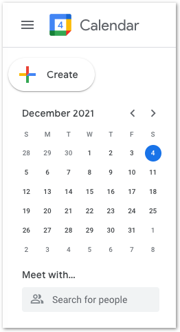
Here there is no sign of Mail, Chat, Spaces or even Meet (!). The right panel has Keep, Tasks, and surprisingly Maps; Maps is actually a good idea for calendar, in case you need to search for a meeting location, but what surprised me is that you can't (or at least I couldn’t figure out how to) add it to the other apps (e.g. Gmail), if you wanted.
Let’s move to Keep (keep.google.com).
In Keep’s left panel, there is no trace of Mail, Chat, Spaces, Meet, and there is no right panel at all. In the left panel, Keep has only its own app navigation, that weirdly replaces the Keep brand at the top when user clicks on Reminders, Archive, Trash (but not Edit labels, for which a pop-up modal shows up). Very uncommon UX, let alone inconsistent with the rest of the Workplace products:

Finally, we have Tasks. Tasks is the only app of this group that doesn't have a standalone web app (but it has a mobile one); tasks.google.com simply shows a 404 error page:

What about the Workspace brand, launched in October 2020 as the new unifying experience for all Google communication and collaboration products? Despite all the marketing effort, I could only find it (for a few seconds) in the loading screen of Gmail and Chat app:

💡 My personal pet peeve: why is Google Workspace brand shown to me (and another 1.5 billion people), when I open the consumer, personal, nothing-to-do-with-work version of Gmail?
This table summarizes the lack of consistency at various levels:

💡 Part 2 presents a redesign proposal for Gmail to first address the issues described here and a strategy for Workspace to then leapfrog competition